

APT Font
Simon Blanck found this logo from the “Swedish corpse burning association” from 1883 as inspirational reference:

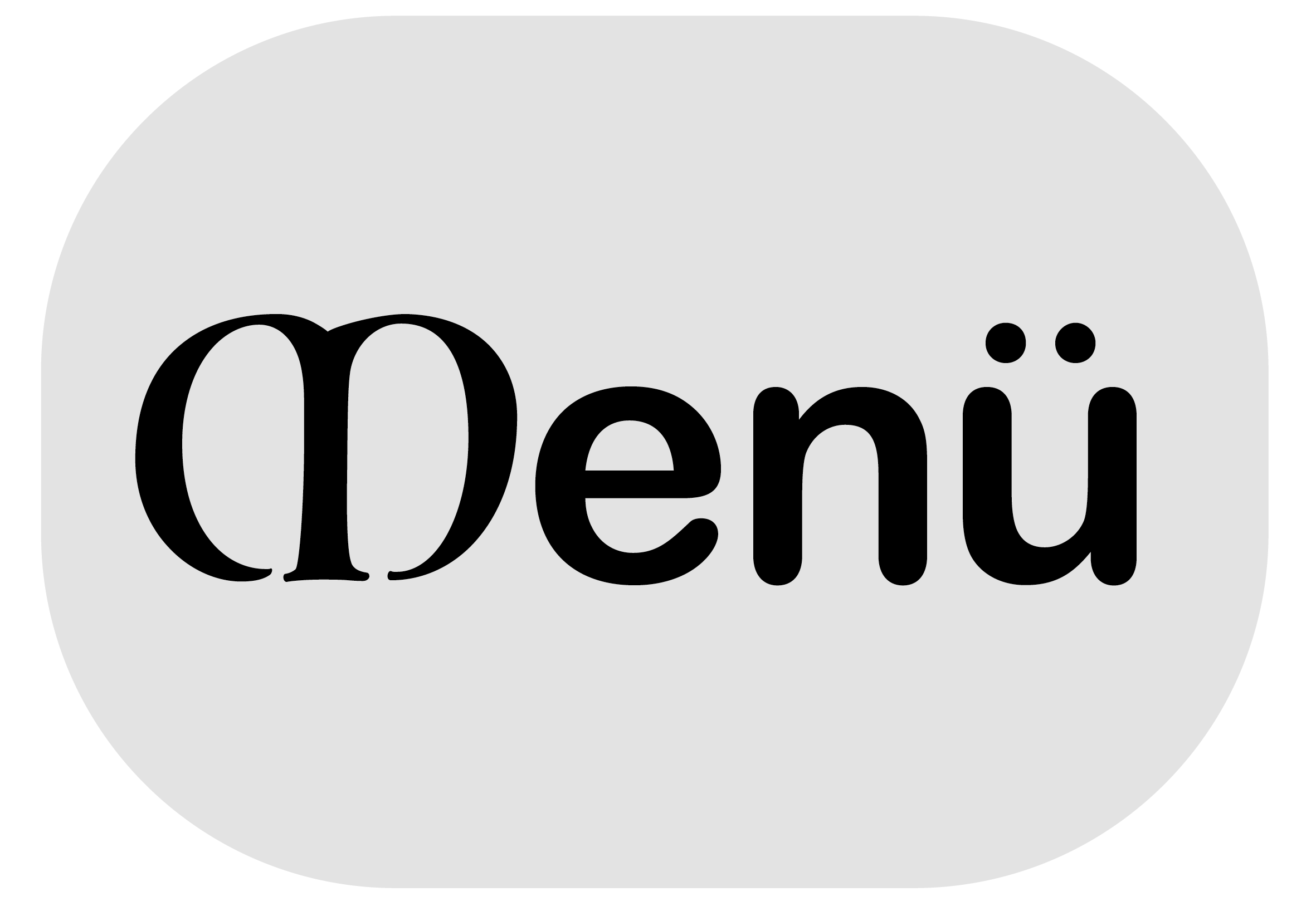
For APT we merged two typefaces that looks to us like simplified equivalents to the shapes used in the Svenska Likbrännings-Föreningen logo: the lower case font is Arial. It was drawn more rounded, the curves softer and fuller and the counters more open. The ends of the strokes on letters such as c, e, g and s, rather than being cut off on the horizontal, are terminated at the more natural angle in relation to the stroke direction. The upper case letters are based on Luminari, a historical calligraphy font also used in APT’s logo.